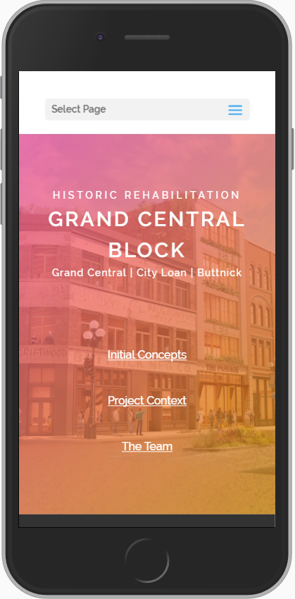
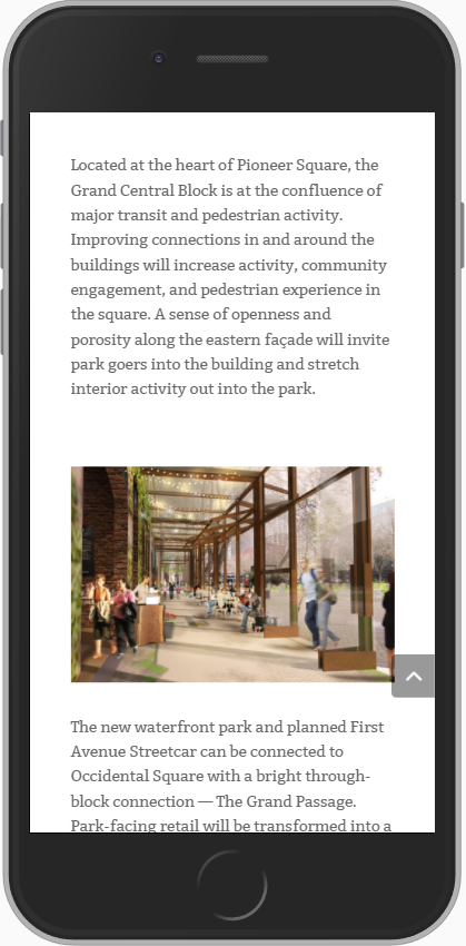
Grand Central Block is a redevelopment project in Seattle's historic Pioneer Square neighborhood. The website needed to cover a few things: the vision for the redeveloped building; the company's appreciation for the historic context of the neighborhood; and the company's long involvement in the Seattle community.
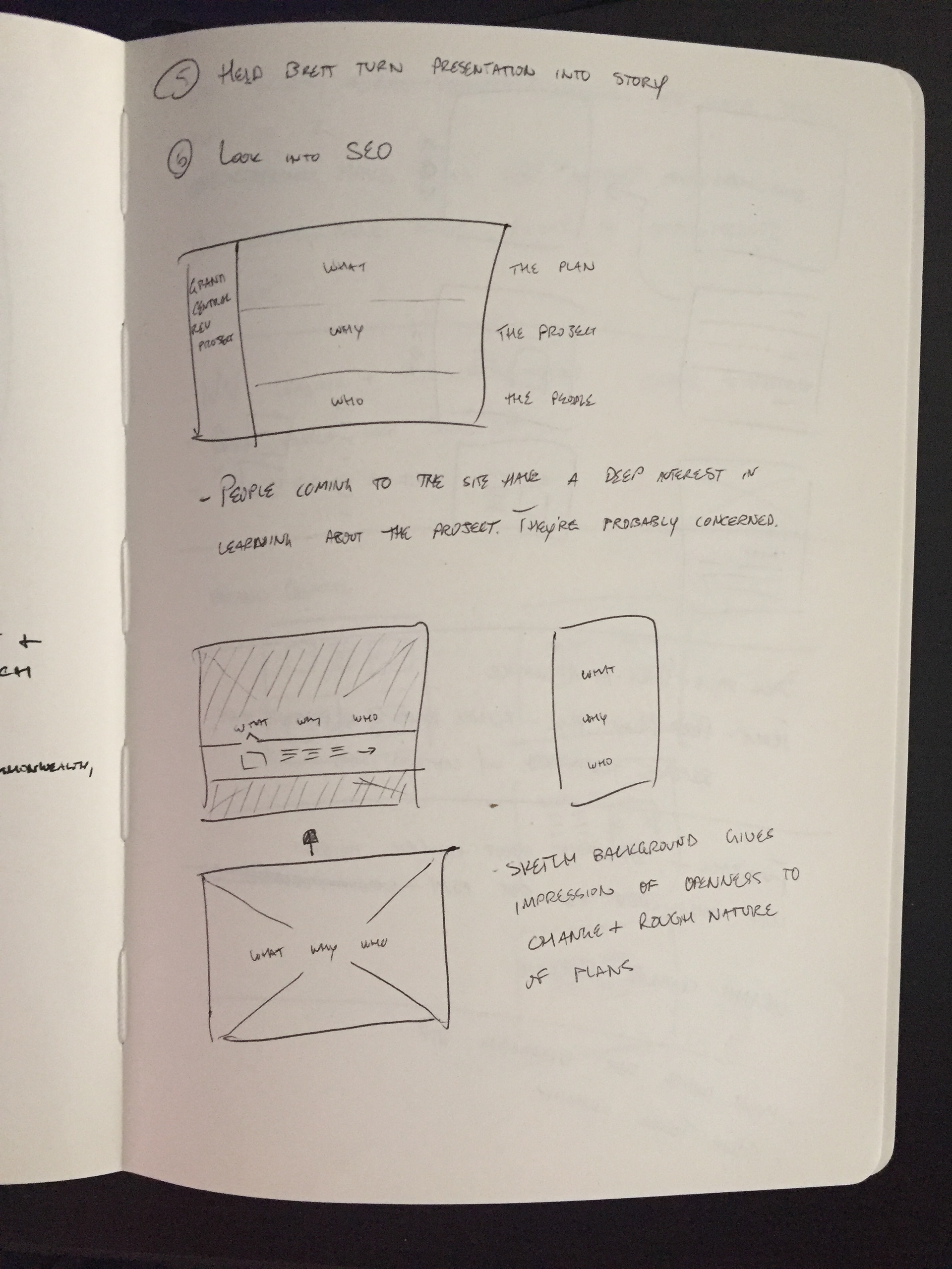
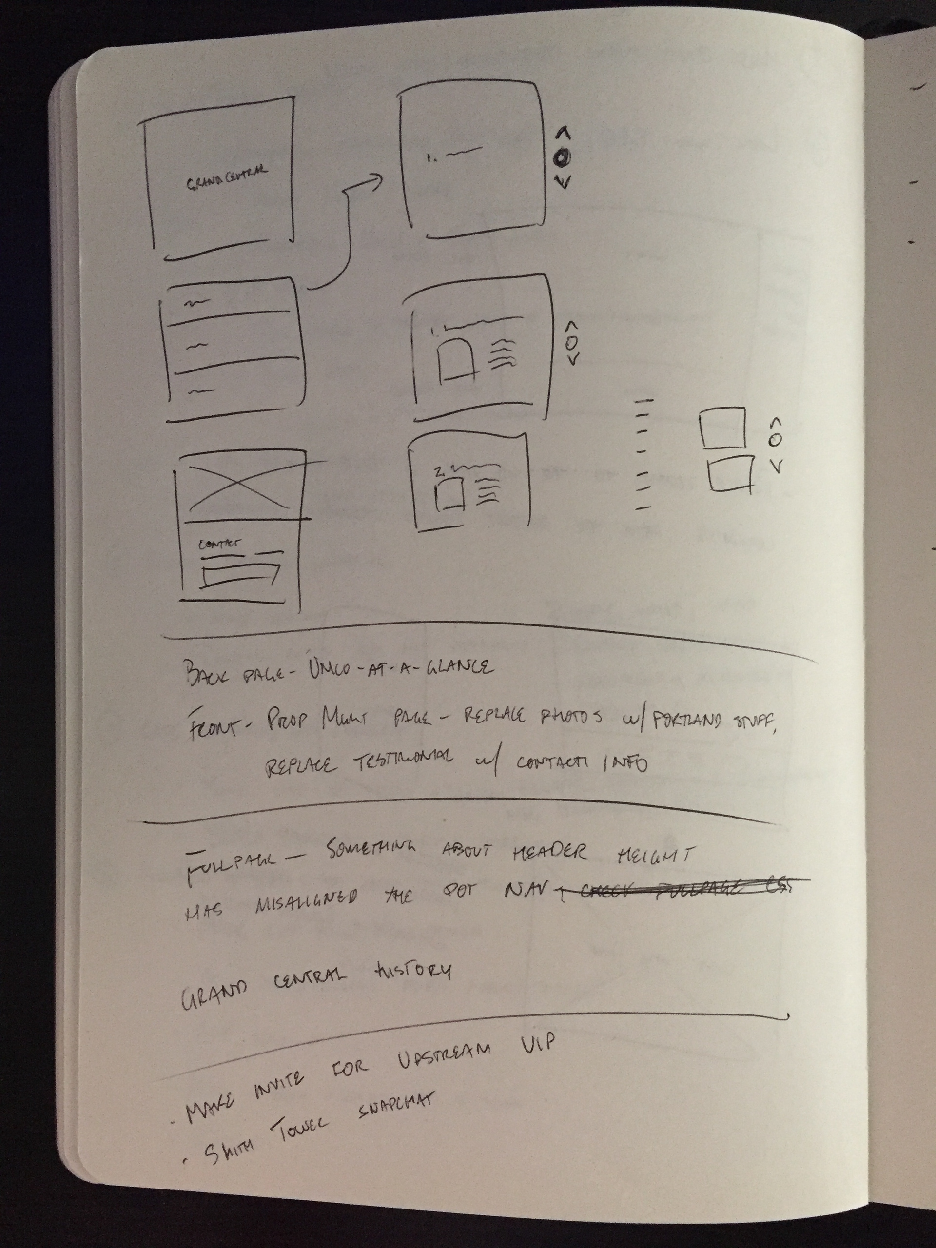
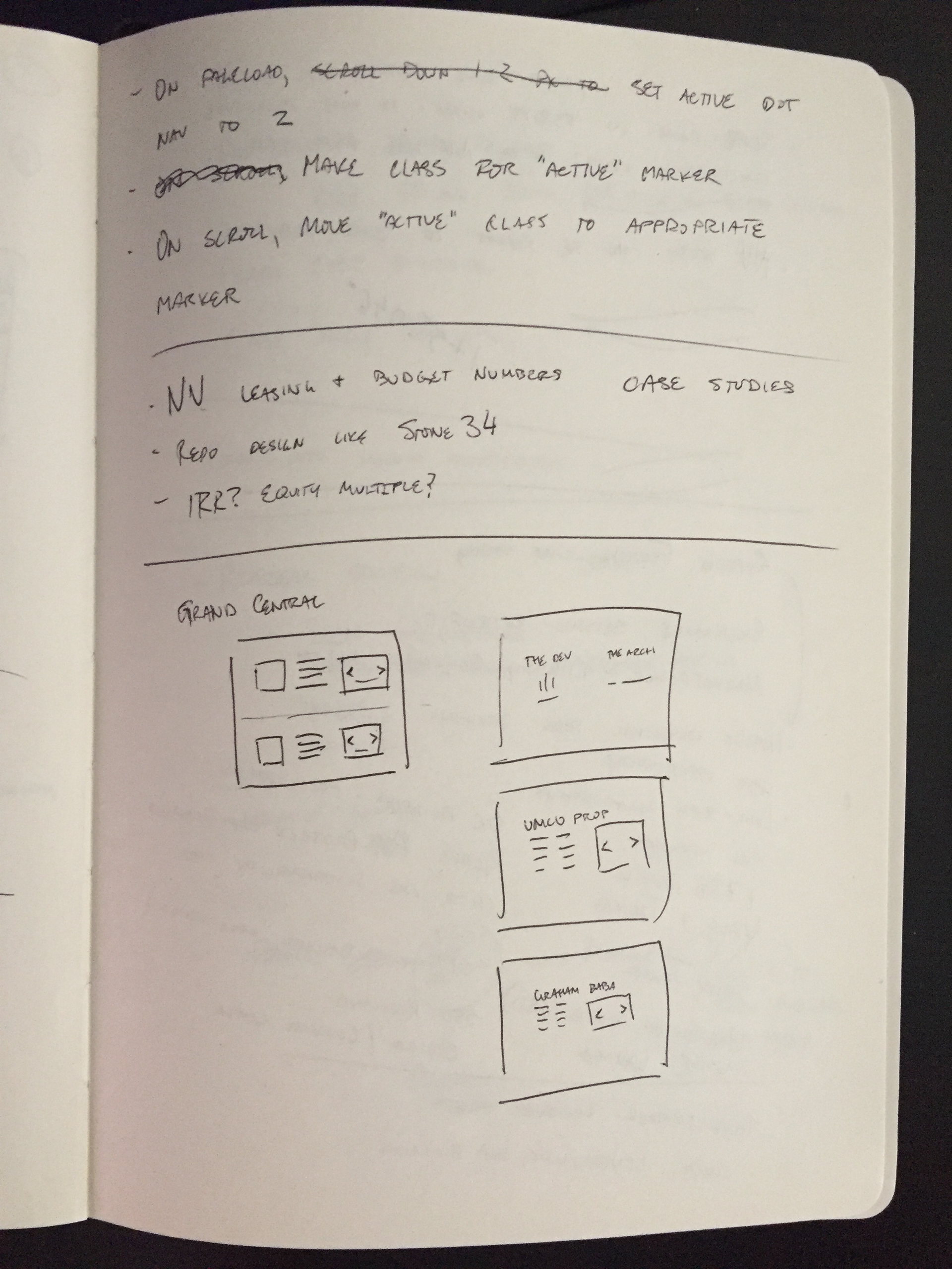
The initial idea was based on a mix between a scrolling website and a PowerPoint presentation: pages would be full screen, and the user would move between pages when they scrolled.
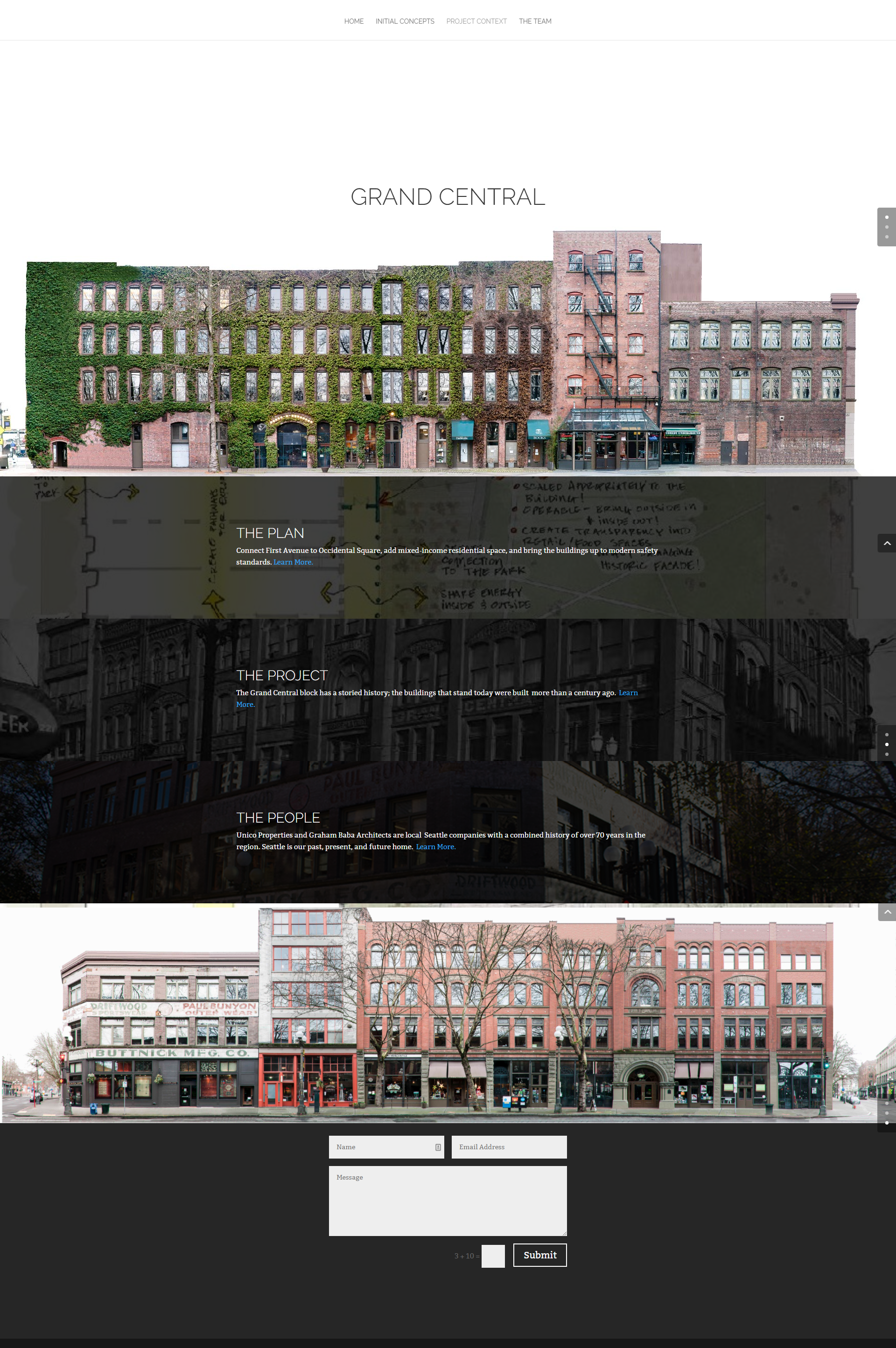
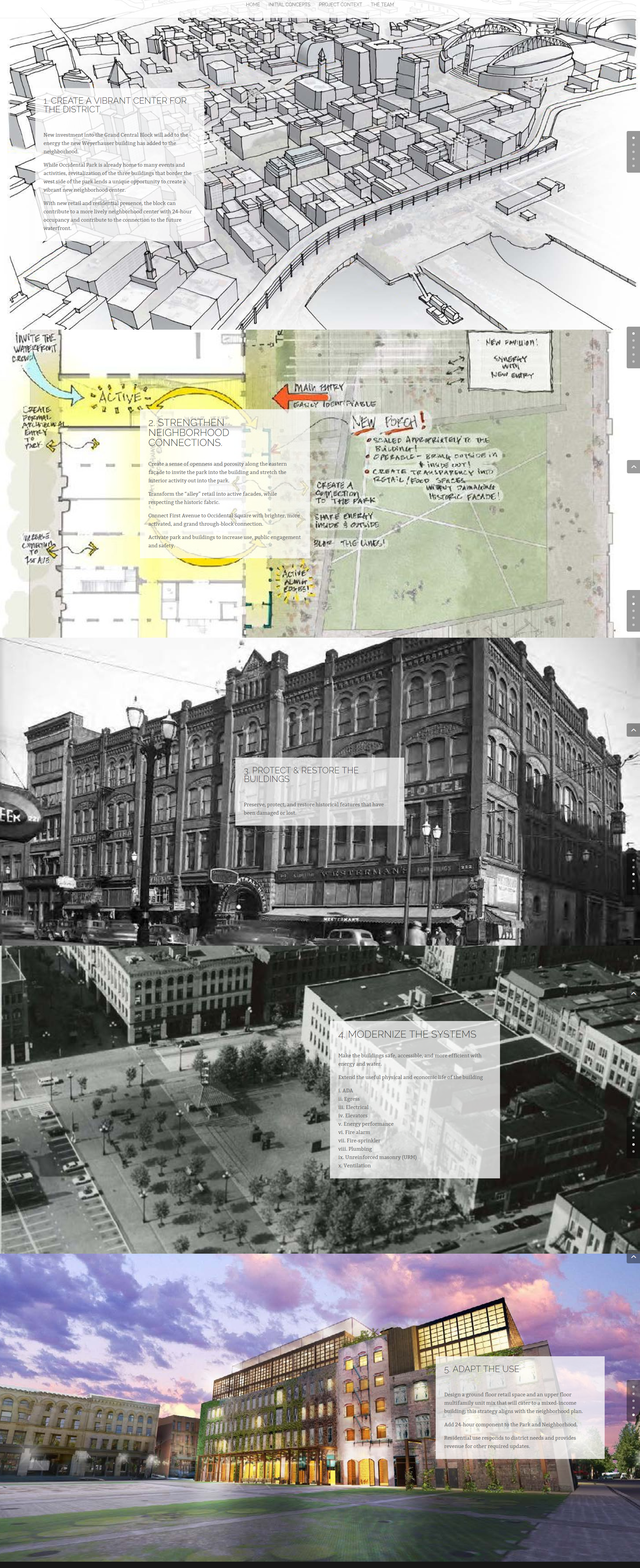
From left to right, the home page, "The Plan," and "The Project."
The first effort was disjointed. With no brand to follow and few visual assets, the site felt either bare or cluttered. The "scroll mousewheel to switch page" script only worked 80% of the time, and many users found it confusing. Though pleasingly alliterative, the structure of "The Plan, The Project, The People" didn't offer useful navigational information.
For round two, I kept the three-part structure of the site but redid the names to make it clearer. After observing user behavior, I also added redundant navigation in the form of a fixed header and footer nav; users in Commercial Real Estate (and perhaps elsewhere) have come to expect the full site structure in the footer. Subpages were rebuilt around a 4-column grid that mimicked a magazine layout. It had the added advantage of being easily adaptable to a mobile layout.


